In acknowledgement of the fact that a lot of data modelling problems have a time component to them (which adds an extra dimension of difficulty to data sets), we will be looking at time series forecasting, what makes them interesting and challenging at the same time. Over a series of posts, we will look at modeling time series data sets from simple models such as Linear regression to non-linear regressions to AR, ARMA, ARIMA and to applying machine learning algorithms such as random forests and neural networks.
What is Time Series?
A time series is a sequence of observations taken sequentially in time. There are different reasons to study a time series data set but generally speaking there are two chief reasons, describing and predicting. In descriptive modeling of a time series data, the main aim is to understand the behaviour and its components such as trend, seasonality, and cycle. With predictive time series modeling, we want to use existing data to predict the future.
This post won’t dwell too much on theory as there is a lot of mathematics that would make it unbearably long. I’ll take a more practical approach and hopefully we can appreciate the power and potential of these models.
Tools
Most of the work will be done primarily in R, of course there are loads of other languages that will do practically the same thing particularly Python. I just have a preference for R. For the dataset, I’ll be working with monthly crude oil prices. No special reason for this particular dataset since this post is for illustrative purposes only.
Let us begin…
First thing is to import the dataset and then do a time plot of the data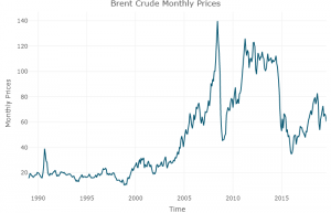
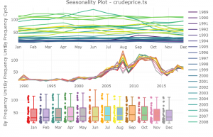
Next is to utilize other visualizations tools to probe the data for seasonality and trend components, we’ll do a heat map and seasonality plot

The data set can also be decomposed into its constituents i.e Trend, Seasonality, cycle and random noise (If all is well with the world, should be white noise process). The tricky part with this decomposition is understanding if the decomposition is additive or multiplicative. We’ll dig into that later. Here, I’ll use a multiplicative decomposition as we can see from the price plot that the data exhibits different growth phases.
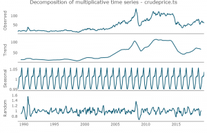
We can see that the trend component captures much of the shape in our original data. Now, to visually inspect the level of correlation between the time series and its lag. This is not a very scientific method to make any inference on the level of relationship between our series and its lag, that is done with the ACF and PACF (Autocorrelation and partial autocorrelation function).

As we can see from the plot above, as the lag increases, the less linear the relationship between the dataset and its lags.

Looking at the ACF plot, the correlation of the series is decaying over time which corroborates the previous multiple lag correlation plots. Clearly, the ACF tells us the dataset is non-stationary ( A stationary time series is one whose properties do not depend on the time at which the series is observed. Time series with trends, or with seasonality, are not stationary.) We can also confirm this by running an Augmented Dickey-Fuller test.
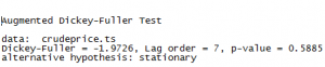
With a high p-value, the null hypothesis that there is unit root cannot be rejected, which confirms non-stationarity. Non-stationarity in the dataset poses a lot of problems and generally speaking, any forecasts made with such data is unreliable. There are methods to make the data stationary with differencing being the most common. That will be treated in another post.
Now, split the data into training and testing sets then train the model with the training portion of the data and then use the test set to see how well the model performs. A first-order auto-regressive model with one-step differencing – ARIMA(1,1,0) is used to model the training set. This is done with the auto.arima() function in R. This function in R uses a combination of unit root tests, minimization of the AIC and MLE to obtain an ARIMA model. The p,d, and q are then chosen by minimizing the AICc(which in this case is 1,1,0). The algorithm uses a stepwise search to traverse the model space to select the best model with smallest AICc. AIC is a measure of model quality and can be used as a model selection criterion. R output:

Let’s look at the residual plot of our model:
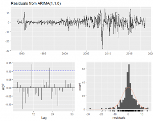
Obviously, this is not a very good model, with the large spikes in the residual indicating outliers in the training data set. The model appears to do a decent job until about year 2000 when volatile spikes began. Similarly, we can see significant autocorrelation with certain lags indicating non-capture of the patterns in the series. Finally, the distribution of the residual does not appear to be normally distributed with its significant skew. A normally distributed residual is required for the reliability of the forecast confidence interval.
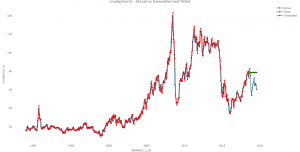
To test the accuracy of the model, it will be compared with the out of sample data set:
![]()
Looking the all the error measures, the model performs poorly out of sample. To get a sense of how poor this model is, here is a plot of the original dataset, the fitted, and forecast:
This brings an end to this post and in the next one, we’ll look at how we can improve on the model presented here. Have a good one.
By Oye Olorunkosebi
0 Comments